A Fresh Coat of Paint: Introducing Multifactor's New Look
2025-05-09
Today marks a significant milestone in Multifactor's journey as we unveil our redesigned brand identity across our digital presence. This redesign isn't just about aesthetics—it's a thoughtful evolution that reflects our commitment to innovation, security, and our multi-faceted approach to identity control and access management.
The Evolution of a Brand

The Multifactor brand has been around in its previous form since at least 2018, when we first began developing an enterprise-oriented version of the unique access management technology behind Solid2FA. When we announced the convergence of Solid Security, MFKDF, and MFCHF under the Multifactor umbrella earlier this year, we knew our visual identity needed to evolve alongside our expanded vision. Our previous branding served us well, but as our solutions portfolio grew and our approach to security matured, we needed a visual language that could better communicate the sophistication and multi-layered nature of our offerings.
The rebrand process began with a simple question: How do we visually represent the concept of "multiple factors" in a way that's both intuitive and distinctive? We wanted a design system that would immediately communicate our core value proposition while remaining flexible enough to accommodate our growing family of products.
The Philosophy Behind Our New Look
At the heart of our redesign is the concept of layered security—the idea that truly robust protection comes from combining multiple verification methods and layers of security technology. This philosophy is embedded in everything we do, from our multi-factor authentication solutions to our approach to post-quantum cryptography.
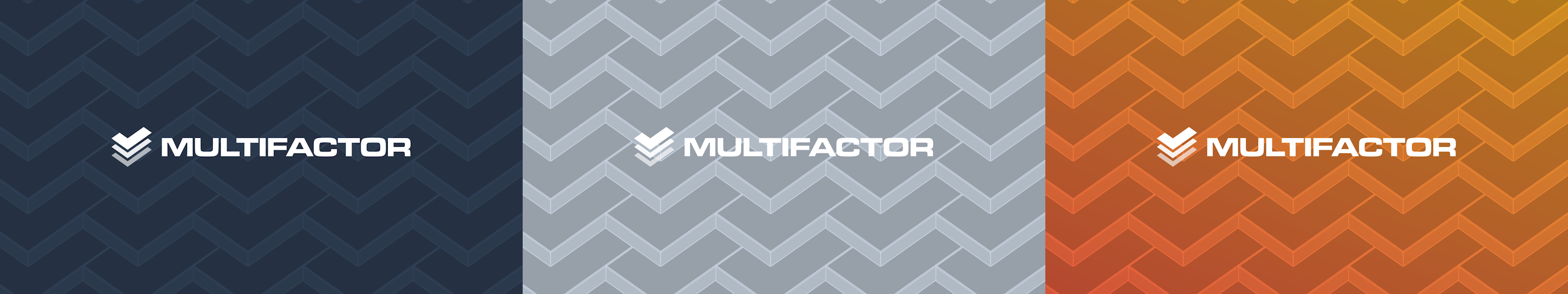
Our product designers translated this concept into a visual identity that features three vertically-stacked checkmarks, representing the three pillars of identity control: authentication, authorization, and auditing. These elements combine to form our new icon—a simple yet powerful symbol that embodies verification and the concept of "multiple factors."
The negative space between these checkmarks subtly forms an "M" for "Multifactor," creating a dual-purpose icon that rewards closer inspection. This attention to detail reflects our approach to security—thoughtful, precise, and designed with purpose.
Our New Color Palette: Security in Technicolor
Moving away from traditional security industry color schemes dominated by blues and grays, our new palette embraces vibrant shades of red, orange, and yellow. This was a deliberate choice to represent the multiple layers of our security approach while projecting confidence and innovation, and paying homage to the yellow-orange gradient that once formed the foundation of our brand.
These colors appear consistently in our branding, often in a vertical stack that reinforces the concept of multiple, distinct layers working together—just like our security solutions.
For situations requiring more subtlety, we've developed a sophisticated secondary palette of five slate gray tones, ranging from light to dark. These provide visual structure and hierarchy across our communications while maintaining a professional, polished appearance.
Typography: Where Function Meets Form
Typography plays a crucial role in any brand identity, and our choices reflect both our heritage and our forward-thinking approach. For headlines and product logos, we've selected Microgramma Std Extended by URW Type Foundry—a retrofuturistic sans-serif typeface that balances high-tech innovation with security and stability. Its geometric precision and distinctive character shapes make it instantly recognizable, helping our products stand out in a crowded marketplace.
For body text and general communications, we've chosen Inter by Rasmus Andersson—a modern, highly legible sans-serif designed specifically for digital interfaces. Its clean lines and excellent readability across different sizes and screens ensure our message comes through clearly, whether on mobile devices or desktop monitors. The text you're reading now is set in Inter, demonstrating its versatility and effectiveness in conveying information.
These typeface choices represent our dual commitment to innovation and accessibility—pushing boundaries while ensuring our solutions remain approachable and user-friendly.
The Dynamic Icon System: Security in Motion
Perhaps the most unique aspect of our visual refresh is our interactive icon system. When users hover over our logos or icons on the web, they're treated to a subtle animation that separates the three checkmark layers, revealing each component while emphasizing the "M" formed in the negative space.
This interaction serves multiple purposes:
- It reinforces our name and brand identity
- It visually demonstrates the concept of multiple, distinct security factors
- It creates a memorable moment of delight and discovery for users
The animation is subtle yet impactful—just like effective security measures should be. It represents our belief that strong security doesn't have to be intrusive or cumbersome; it can be elegant, thoughtful, and even delightful when implemented correctly.
Product Identity: A Unified Family
One of the key challenges in our rebranding was creating a unified visual system that could accommodate our diverse product lineup while maintaining a strong family resemblance. Our solution was to develop a templating system that maintains consistent typography, color usage, and structural elements across all product logos.
Each product in our ecosystem now follows the same basic template as our main brand logo, with the checkmark being replaced by a unique icon that represents that product's specific function. This approach creates instant recognition of Multifactor products while allowing each solution to maintain its own distinct identity.
For example, MFKDF uses a hexagon-based icon and background pattern that differentiates it from our main checkmark pattern, while still adhering to our core design principles and color system. This balance of consistency and flexibility allows our brand to scale gracefully as we continue to expand our product offerings.
Backgrounds That Tell Our Story
Beyond our logo and colors, we've developed a distinctive system of 3D geometric backgrounds that create a sense of depth and dimensionality. These backgrounds feature an infinitely tiling pattern of 3D prisms based on a checkmark (fused herringbone) pattern, viewed from a 45° angle.
This pattern serves as a visual metaphor for our approach to security—comprehensive coverage through repeating, interlocking security measures. The infinite repetition recalls our core theme of "multiple factors" and represents the tight, seamless integration of Multifactor's products and solutions.
We've created these backgrounds in three distinctive styles—flat checks, raised checks, and stepped checks—each providing different levels of visual depth and allowing for flexibility across various applications. Whether displayed statically or with subtle animation, these backgrounds create a distinctive visual environment that's uniquely Multifactor.
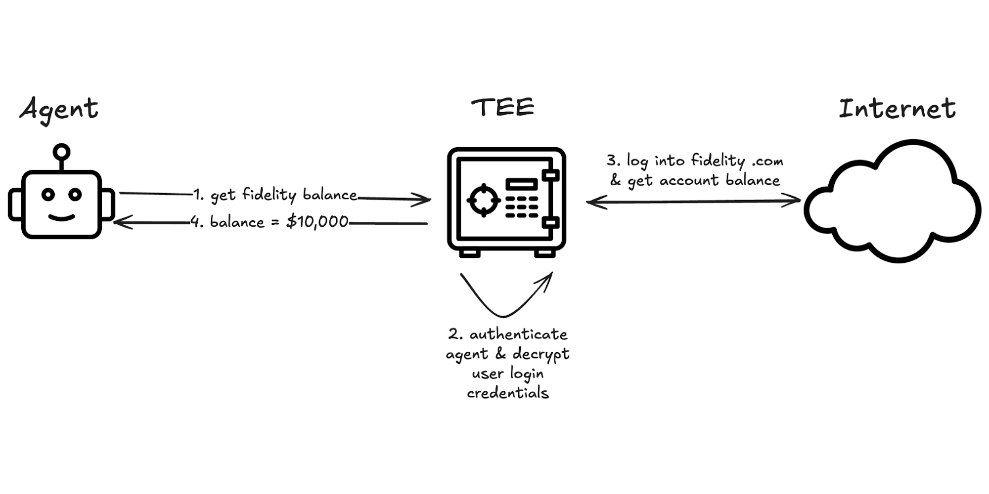
Graphics That Explain Complex Ideas
Security and cryptography are inherently complex subjects, often difficult to explain through text alone. To address this challenge, our rebrand includes a comprehensive system of flowcharts and diagrams designed to make our solutions more accessible and understandable.
These graphical elements use consistent visual language to illustrate how products function, how data flows through systems, and how multiple security factors integrate to create comprehensive protection. By visually mapping these relationships, we can more effectively communicate the value and functionality of our offerings to both technical and non-technical audiences.
Putting It All Together: A Cohesive Digital Experience
Today's launch extends beyond just visual elements—it represents a comprehensive overhaul of our digital presence. Our redesigned website creates a unified platform where visitors can explore our entire product ecosystem, from our flagship authentication solutions to our open-source cryptographic libraries.
The site architecture reflects our approach to security: layered, interconnected, and comprehensive. Navigation is intuitive, content is clear and accessible, and our new visual system is applied consistently throughout the user experience.
The Road Ahead
This visual refresh is more than just a new coat of paint—it's a foundation for the next phase of Multifactor's growth. As we continue to develop new solutions for the post-quantum era, our brand system will evolve alongside our offerings, maintaining the core principles while adapting to new challenges and opportunities.
We've always believed that truly effective security solutions should be both powerful and accessible—complex in their implementation but simple in their user experience. Our new brand identity embodies this philosophy, creating a visual language that communicates sophistication while remaining approachable and human.
Carrying Forward Our Legacy
While today marks the debut of our new look, we remain committed to the core values that have guided us from the beginning. The unified Multifactor brand builds upon the legacy of Solid Security, MFKDF, and MFCHF—bringing together proven technologies and forward-thinking security approaches under a cohesive visual identity.
Our refreshed brand may be new, but our mission remains unchanged: to provide security at scale through innovative, cryptographically sound, and user-centric solutions.
Explore Our New Look
We invite you to explore our redesigned website and experience our new brand identity firsthand. Hover over our logo to see the animation in action, discover the details in our background patterns, and get to know our expanded product family through their distinctive yet unified visual identities.
For those interested in exploring the design system in more detail, we've also published a comprehensive brand guide that outlines the philosophy, components, and usage guidelines for our visual identity.
A Word of Thanks
Finally, we want to extend our sincere thanks to everyone who contributed to this rebranding process—from our internal feedback team to the external product design partners who provided valuable insights. Creating a visual identity that truly represents our values and vision was a collaborative effort, and we're grateful for the thoughtful contributions that shaped the final result.
As always, we welcome your feedback on our new look. This brand, like our products, will continue to evolve and improve based on the needs and responses of our community.
Here's to the next chapter of Multifactor—same mission, fresh perspective, and a visual identity that truly represents who we are and where we're headed.
We're redefining zero-trust — so you can protect your accounts with confidence.
Identity is your first and last line of defense, and the root cause of most application security breaches. Multifactor's provably secure zero-trust solutions cryptographically guarantee that only authorized users can access sensitive data, turning identity into your greatest asset in the fight against cyber threats. Learn more about our research, or reach out to explore working together.
Related Posts
Keypo + Multifactor: A founder’s reflection on the acquisition
2026-06-15
Earlier this month we announced that Keypo has joined Multifactor. This is the story of the problem, the two halves we each solved, and what we're building now that we're one company.
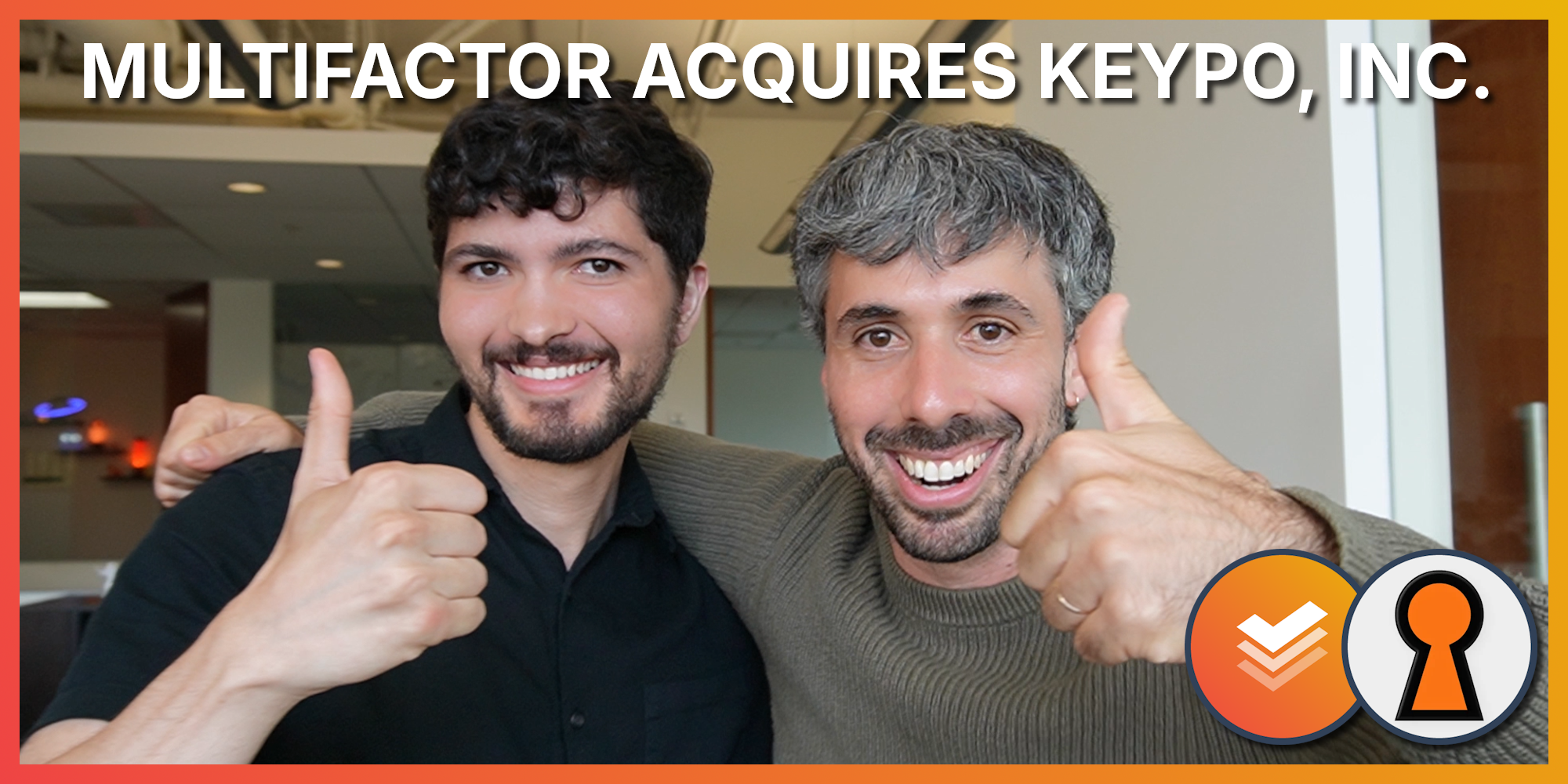
Multifactor acquires Keypo to accelerate zero-trust security for AI agents
2026-06-01
We're proud to share that Multifactor has acquired Keypo, Inc., a programmable encryption company. Keypo's founder, Dave Blumenfeld, is staying on as Multifactor's Founding Engineer.

We're Hiring
2026-03-02
Multifactor is hiring. If you are a talented engineering leader or individual contributor who cares deeply about forging the future of authentication, authorization, and auditing for the agentic era, you should probably check out our open positions.